7 QC Tools - 7 quality management tools businesses need to know
7 quality management tools are tools used to aim to grasp your problems more proactively and effectively. So what are these 7 tools? Please find out through the article below of VCR.
What are 7 QC tools?
7 quality management tools - 7 quality control tools or 7 QC Tools (7 Quality Control Tools) are all names referring to simple chart and statistical tools, used by businesses to aim to grasp their problems more proactively and effectively.
These tools are commonly used by quality control engineers, not only in relation to the product but also in relation to the quality of work taking place within the organization.
The 7 quality management tools are:
- Check sheets
- Charts
- Cause and Effect Diagram
- Pareto chart - Pareto chart
- Histogram
- Scatter Diagram
- Control Chart
Read more: 5 core tools
Main content of 7 quality management tools
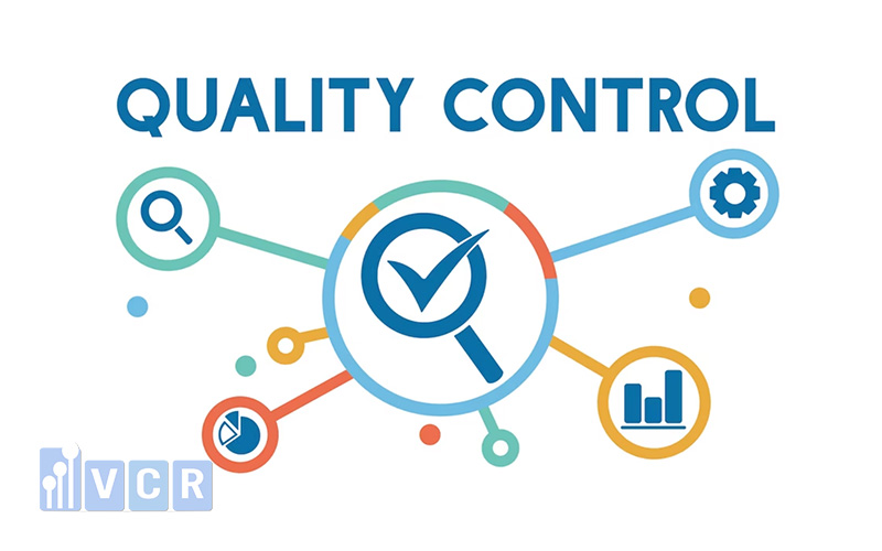
Check sheets
1. Concept
A check sheet is a means of storing data, which can be a record of past activities, or it can be a tracking device that allows you to see trends or patterns objectively and completely. It is a simple form of storing some statistical methods of data needed to determine the priority of events, and the daily work of each business.
Control sheets are commonly used to:
- Check the distribution of data of a production process indicator
- Check each product for defects
- Check the location of defects
- Check the sources of product defects
- Check job confirmation
Typically, a Checklist will track events over time but can also be used to track the number of events by location. This data can then be used as input to a Concentration Chart, Pareto Chart, etc.
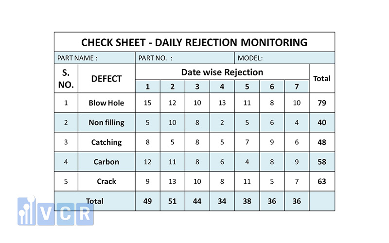
Examples of issues to track could be: number of failures per month, service calls/week, hazardous waste collected/hours worked, etc.
2. Types of inspection forms
Purpose form
- To control work in the factory
- To check
- For the manager to control and operate
- To analyze
Content format
- Frequency distribution chart format (marking subgroup values)
- Check the required items
- Combine with cause and effect diagram
- Combine with drawings or photos
- Check or mark over time
- Reclaim defective parts or products by form or by cause
3. Steps to design a test form
Step 1: Select the specific parameters or data to collect
Step 2: Determine collection time (day, week, shift, quarter...)
Step 3: Develop an appropriate form (may include information about collection location, performer, reason or special comments, use explanatory titles, show measurement units in the inspection form, etc.)
Step 4: Check the inspection form and make changes (if necessary).
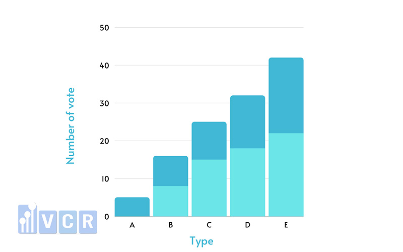
Charts
A graph is a drawing that shows the relationship between numbers or quantities.
Charts are used to visualize data so that it can be easily understood by the naked eye.
There are many types of charts: Line charts, column and line charts, pie charts, bar charts, Gantt charts, spider charts.
Cause & Effect Diagram
1. Concept
Cause and effect diagram is simply a list of possible causes that lead to an effect. This tool was developed in 1953 at the University of Tokyo by Professor Kaoru Ishikawa. He used this diagram to explain to engineers at the Kawasaki Steel Plant how different factors are arranged and shown to be linked together. Therefore, the cause and effect diagram is also called Ishikawa diagram or fishbone diagram.
Purpose:
It is a method to find the cause of a problem, from which corrective action is taken to ensure quality. This is the most used tool in finding causes and defects in the production process.
This tool is used to study and prevent potential risks that cause poor quality operations related to a phenomenon, such as waste, quality characteristics, and at the same time helps us grasp the whole relationship in a systematic way. People also call this diagram a fishbone diagram, an Ishikawa diagram, or in Japanese, Tokuzei Yoin - a characteristic chart...
The purpose of this chart is to help us list and classify potential causes, not to give us a way to eliminate them.
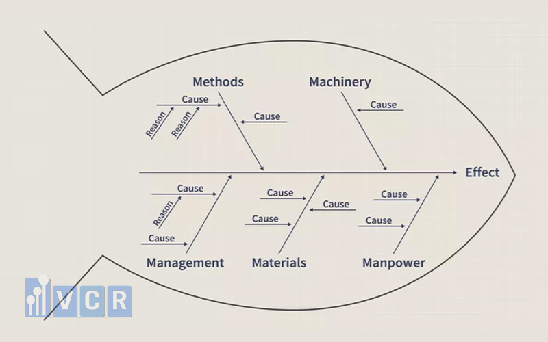
2. Construction steps
Step 1: Identify the problem to be analyzed. Write the problem choice at the fish head position. Draw a large arrow (Spine).
Step 2: Use the Brainstorming method to discuss in groups to come up with possible causes of the problem. Use the 5Why method to ask questions and analyze the problem in depth.
Group the causes and identify the bones of the diagram.
Step 3: Review the diagram before finalizing, eliminating any causes that do not apply. Brainstorm to get more ideas for expanding the sub-branches of the fishbone.
Pareto Chart
1. Concept
Pareto Chart is a bar chart used to classify causes/influencing factors taking into account their importance to the product. Using this chart helps managers know which causes need to be focused on. Note that Pareto charts should be used to analyze the causes and costs caused by those causes.
Separate the most important causes from the trivial causes of a problem. At the same time, identify and prioritize the most important problems. In addition, Pareto charts are also used to evaluate the effectiveness of improvements.
- Applicable when: Analyze data related to a problem to determine which factors are most important in influencing that problem.
- Pareto chart shows the number and percentage of defects in mechanical processing.
- Pareto analysis is also very important in the improvement process. Therefore, improvement implementation should be used with many statistical tools.
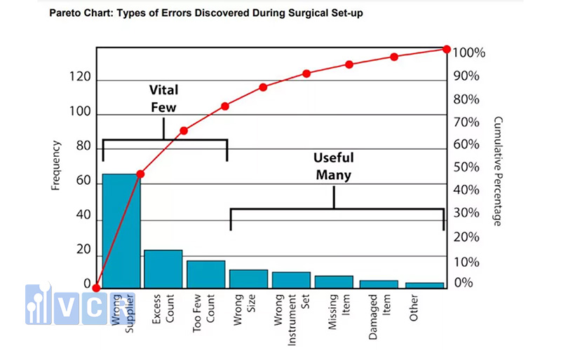
In quality management, it is also commonly observed that:
- 80% of quality losses are caused by 20% of causes.
- 20% of the causes cause 80% of the poor quality.
2. Construction steps
Step 1. Determine what problem to research and how to collect data:
- Identify the problem to be researched (items of defects, failures, losses, frequency of risk occurrence, etc.)
- Identify the data needed to classify them (defect type, location, process, equipment, worker, method).
- Determine the data collection method and data collection time (day, week, month, quarter, year...).
Step 2. Make a checklist listing the items
- Should rely on available coupons
- If there are no forms available, new forms must be created according to actual items (targets).
Step 3. Fill in the data table and calculate.
- Calculate the total of each item, the cumulative total, the overall percentage, and the cumulative percentage.
Step 4. Create a data table to draw a Pareto chart:
- Arrange the figures in descending order of category from top to bottom.
- If there are other groups of forms, put them last.
Step 5. Draw the vertical and horizontal axes
- Vertical axis
- Divide the left vertical axis from 0 to the total of all indicators (cumulative total)
- Divide the right vertical axis from 0% to 100%
- Horizontal axis: Divided into intervals according to the number of classified items.
Step 6. Build a column chart
- Draw the indicators in column form according to the data of the established table, in order from left to right next to each other.
Step 7. Draw the cumulative curve (Pareto curve)
- Draw a diagonal line across the first column, starting from the lower left end point towards the upper right end point of this column.
- Mark the cumulative values at the top right of each column item's distance, connecting the points with a straight line.
Step 8. Write the relevant information needed for the Pareto chart.
Step 9. Pareto chart analysis:
- The higher columns correspond to the curve sections with the fastest increasing cumulative frequency, representing the most frequent failures that need to be addressed as a priority.
- The lower columns correspond to the curve segments with less cumulative frequency increases representing less important, less frequent failures.
Histogram
1. Concept
A histogram is a simple type of bar chart. It aggregates data points to show the frequency of events.
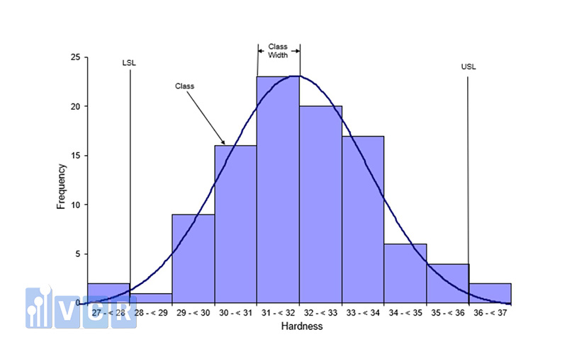
Purpose:
Used to monitor the distribution of product/process parameters. From there, evaluate the capacity of that process (Does the process meet the product manufacturing requirements?). It is a bar chart showing the frequency of problem occurrence (collected through inspection forms).
Application: Prevent problems before they can occur.
2. Construction steps
Step 1. Collect data values
Step 2. Determine the largest and smallest numbers
Step 3. Determine the width of the distribution
Step 4. Determine the number of layers (number of columns)
Step 5. Determine the width of each layer
Step 6. Create a frequency table
Step 7. Determine the mean value of the distribution
Step 8. Draw a chart and fill in the information (upper and lower limits, average value)
Scatter Diagram
1. Concept
A scatter diagram is a graphical representation of data in which the observed values of one variable are plotted as points against the values of the other variable without connecting the points with a line. A scatter diagram shows the relationship between two factors.
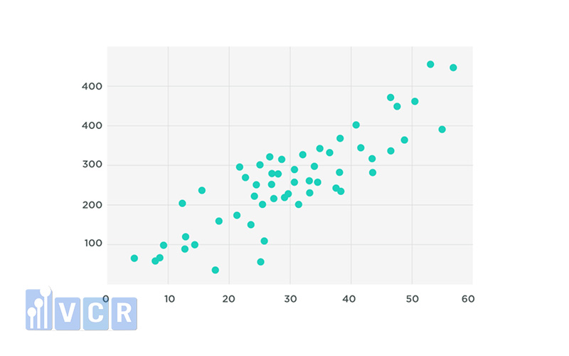
Purpose:
- To solve problems and determine optimal conditions by quantitatively analyzing the causal relationship between the variables of these two factors.
- By analyzing the graph, it is possible to see how one factor depends on another and the degree of dependence between them.
2. Construction steps
Step 1: Collect data
Step 2: Determine the appropriate ratio for the vertical and horizontal axes so that both are approximately equal in length.
Step 3: Draw a data diagram on paper. In case of overlapping between two data systems, we can use one of the following methods.
Step 4: Fill in all the necessary information in the chart
Step 5: Read the chart
Control Chart
It is a chart with limit lines calculated by statistical methods used to monitor the fluctuations of product quality characteristics parameters, monitor process changes to control all abnormal signs that occur when the chart goes up or down.
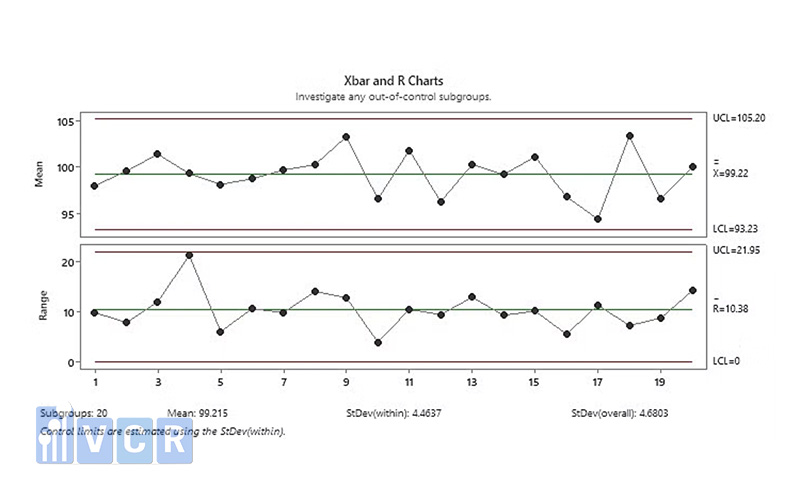
Purpose: Detect abnormal situations that occur during the production process.
Why should we apply 7 QC tools?
These are basic tools that help businesses control and improve their processes and quality of work.
The main purpose of these 7 tools is to check the production process, identify and clarify problems that occur, control product quality, propose solutions and ways to prevent problems in the future.
Effective control results demonstrate the ability of the business to improve. They are more proactive in understanding their problems, understanding their priorities and what they need to do to solve them.
Applying the 7 QC tools not only benefits businesses but also consumers, because they receive products of good quality and worth the cost they paid for.
Benefits of 7 QC tools
Proactively control and improve work quality, minimize errors occurring during the production process.
Save costs incurred on defective products that must be replaced during production or after they have been shipped and sold.
Enhance awareness and working skills; be proactive in analyzing and solving employee problems as well as the ability to control product quality.
Identify and clarify problems early to promptly provide solutions, avoiding waste of resources and costs.

Control and detect failures and defects of machinery and equipment systems; conduct maintenance and repair to ensure uninterrupted work flow.
Affirm brand reputation and product quality to customers and other business partners
When to use 7 QC tools?
Enterprises can choose one of the 7 appropriate quality control tools in the entire management process - quality improvement, six Sigma implementation process or PDCA program to improve quality management.
Steps to apply 7 QC tools
7 quality control tools are simple but the results are extremely practical and effective. Depending on each specific case, businesses can choose to use them individually or combine them together to bring the best results. Below are the steps to apply these tools:
- Clarify the problem to be solved
- Analyze and select tools based on feasibility
- Collect the necessary data accurately and completely
- Analyze existing data, evaluate and identify problem causes to determine appropriate improvement measures.

7 New Quality Management Tools - 7 Management Planning Tools
7 new QC tools also known as 7 planning and management tools. Used for planning, problem solving and goal setting for organizations and individuals.
- Affinity Diagram- organizes a large number of ideas into their natural relationships.
- Relation diagram - also known as interrelationship diagram, shows cause and effect relationships and helps analyze the natural connections between different aspects of a complex situation.
- Tree diagram - breaks down broad topics into finer and finer levels of detail, helping to move thinking step by step from the general to the specific.
- Matrix Diagram - shows the relationships between two, three or four groups of information and can provide information about relationships such as power, the roles of individuals or measurements.
- MDAC Matrix Data Analysis Diagram - a complex mathematical technique for analyzing matrices often replaced in this category by the similar “Priority Matrices”. One of the most rigorous, careful, and time-consuming decision-making tools. It is a useful tool in deciding what to do after key actions, criteria, or characteristics that are critical to quality (CTO) have been identified, but their relative importance is unknown and uncertain.
- Process Program Decision Chart (PDPC)- systematically identifies possible deviations in the plan being developed.
- Arrow Diagram - also known as “activity network diagram”; shows the order of tasks required in a project or process, the best schedule for the entire project, and potential scheduling and resource problems and their solutions.
PN